The prefix “Uni” means one, therefore, univariate analysis is the analysis of one variable at a time. The main reason for which we use univariate analysis is to describe the data. The analysis then uses the data, summarizes it, and then finds some pattern in the dataset.
Plots used for Univariate Analysis:
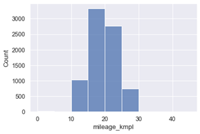
- Histogram: A histogram groups values into ranges (or bins), and the height of a bar shows how many values fall in that range.
- Range of the data: The smallest and largest values are on opposite ends of the histogram. Highly concentrated regions can also be observed. The taller bars are where most data points fall and smaller bars represented ranges appear as gaps or short bars.
- Shape or skewness of the dataset: A dataset can be right skewed (tail is towards right), left skewed (left-tailed), normally distributed (one centre), or randomly distributed (no apparent pattern, multiple peaks).
- Presence of outliers: These appear as secluded bars on the far left or right (negative or positive outliers).
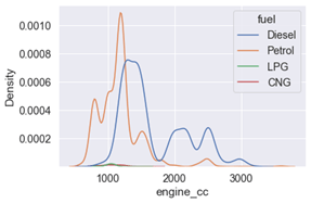
- KDE Plot: The ‘Kernel Density Estimate’ plot creates a smooth version of a histogram by normalizing all points to appear under one curve.
It is mainly used when checking a variable’s distribution between groups of another variable. This principle is called segmented univariate distribution.
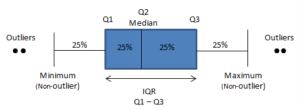
- Box plot: A boxplot shows the distribution, centre and skewness of a numeric feature. It divides the data into sections that contain 25% of the data approximately.
Outliers, if present, appear as circular discs on either end. The lines that extend from the box represent the smallest and largest values. The box depicts the Interquartile range and holds data between the 25% and 75% quartile range.
Boxplots take up lesser space as compared to histograms because they show lesser details. They also define quartile locations and are good for quick comparisons between different features or segments.
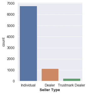
- Countplot: A count plot compares different classes of a categorical feature and how often they occur. It is like a bar chart with the bar height showing number of times each class shows up in the data.
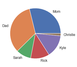
- Piechart: A pie chart displays the percentage distribution of a categorical variable in a circular graph.
Pie charts are not used much frequently in the visualisation community. Firstly, the graph appears cluttered when the groups exceed four. And secondly, sometimes the widths for the slices are not visually clear.
