Multivariate plots are designed to reveal the relationship among several variables. This is a more complex analysis technique and is used when more than two variables are in the given set of data.
There are 5 types:-
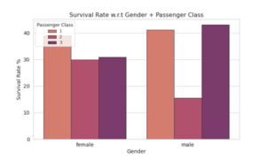
1. Bar Plot:- When there are two categorical variables and one numeric variable. We use bar plot to visualize the relationship between variables. Mainly bar plot is done using Seaborn and Matplotlib. Bar plot is used for comparision of summarized data.
2. Scatter plot- This plotting technique is used to display the relation between the two numeric variables but third variable can be used in a scatter plot to differentiate the hroups within the data. This is also done by Matplotlib and seaborn. It is used for the identification of correleational relationships.

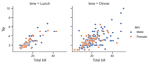
3. Side by side or Faced grid plot:- Sometimes it is harder to compare visualization side by side. In this case we use faced grid in which X-axis and Y-axis are shared between the plots whereas the third is used to separate the data points within each plot using specific value. Seaborn package in python is used to perform this type of plot.
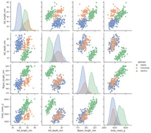
4. Pair plots:- As we can guess by the name, these plots create a pair of each variable with variables in the data which includes the pair with itself too. In this the diagonal includes the the pair of each variable with itself. Seaborn package is used for performing this type of plotting.
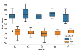
5. Box plot:- This visually shows the distribution of numeric data and skewness through displaying data qualities like percentile and averages. This is used for finding outliers in the given data.
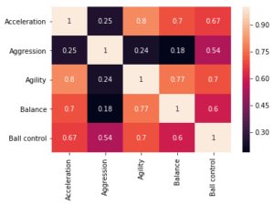
6. Heat map:- This is the mostly heavily used summarization visualization technique in which the correlation between every pair is darker and the result in a coloured plot. The coloured plot shows a higher correlation between the variables.
